
5 charts that explain US healthcare today
Charts on what kills us, how medicare cuts saved the deficit, and more

I hosted another “Charts and Tarts” event (writeup from the last one) where people bring an interesting chart and we eat some tarts. The theme this time was healthcare and below are 5 charts featured with my key takeaways. I’m not a “healthcare guy” so I enjoyed learning from some experts.
Reach out if you want to be included in the next one!

1) What kills us vs what gets covered

There are big differences in what people die from, what people search for, and what the media covers. There are plenty of interesting takeaways, but the main one we discussed is the dichotomy between heart disease and cancer.
Despite being the #1 killer in America, the media barely covers heart disease and people barely search for it (unlike Cancer, the #2 killer). We discussed some reasons why that might be:
Causes and treatments: We better understand the causes of heart disease and how to treat it compared to cancer. Cancer is also seen as more “random” and not as due to lifestyle choices, which makes the public more sympathetic to its victims and makes it more likely to get covered by the media.
Financial incentives: There’s more unmet need for treating cancer compared to heart disease and more money going towards solving the problem. For cancer, there are higher reimbursements, more advocacy organizations, and more money for drug trials (only ~5% of clinical trials are for heart disease vs 40% for cancer, see chart).

This data is from 2016 and only for deaths, so one thing we discussed was how different it would look if updated more recently (ex: where would COVID rank?) and if we looked at serious disease as opposed to death. Diabetes or auto-immune disorders don’t directly lead to as many deaths but impact as many people as heart disease.
2) American healthcare is about the top 5%
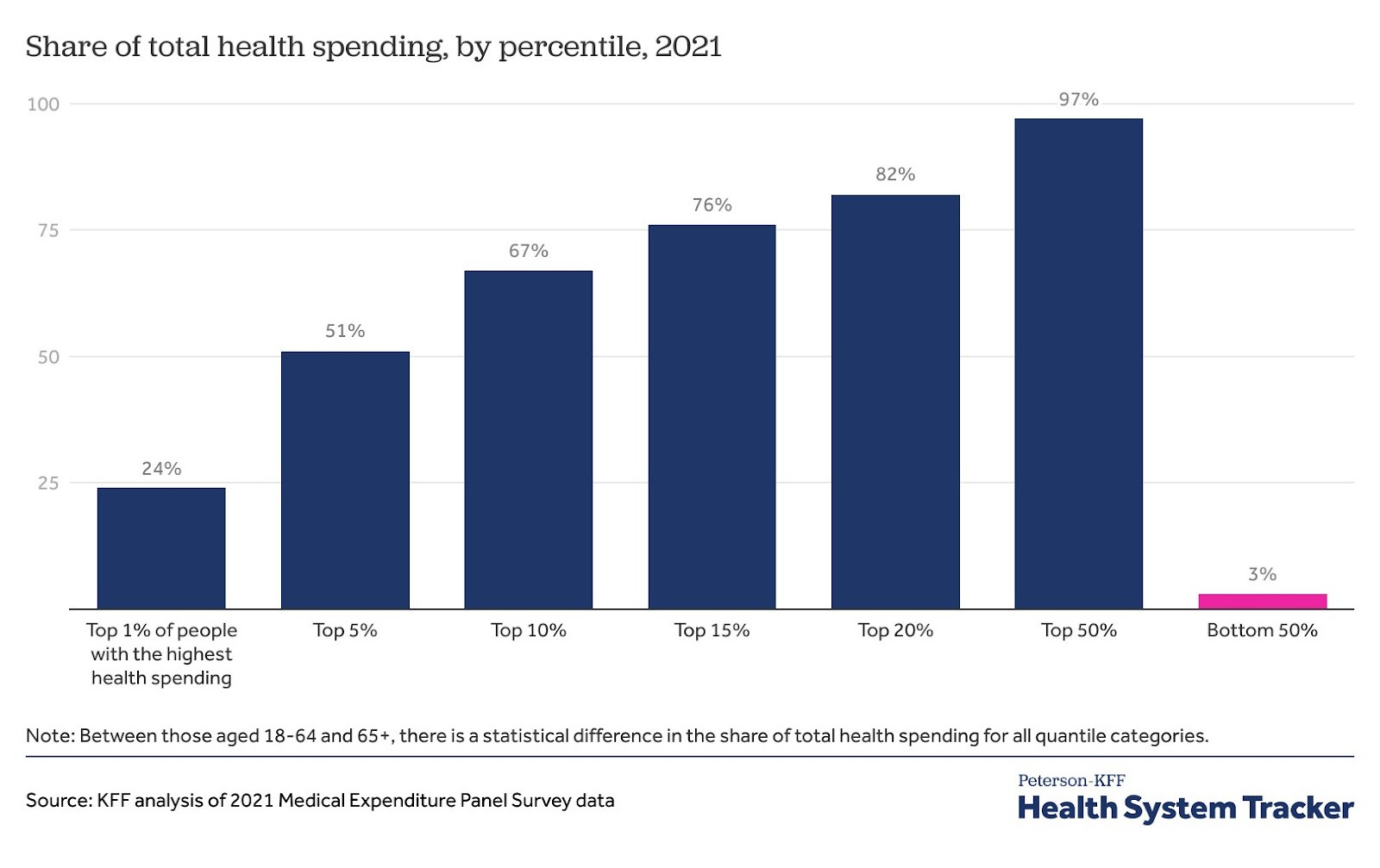
Health spending in the US follows the classic Pareto principle where 20% of the population drives ~80% of the spending each year. But more crazy is the top 1% drives 24% and the top 5% drives 51%.
This top 5% is what almost every healthcare debate in the US revolves around.
They drive the excess spending in the US, often due to end-of-life care or other expensive diseases to treat.
The whole discussion around “value-based care" is about how to reduce costs for this top 5%. Most drugs and other medical innovations are also focused on them.
As one attendee noted, “the US healthcare system is built for the top 5% of patients, whereas other systems (like the UK’s NHS) are built for the bottom 50%.” Any discussion about reducing healthcare spending for this cohort gets into thorny questions on what we value (ex: how much to spend on end-of-life care).
3) The US deficit has been saved by a slowing in Medicare spending

An underrated trend in the last 15 years has been the slowing of Medicare spending. Real spending per beneficiary has been flat since 2011 which equates to $3.9 trillion saved relative to the trend it was on. It’s so much money that no major legislation passed during this period comes close in scale.
No one can fully explain the slowdown, but a few things have helped:
Policy: The Affordable Care Act reduced Medicare’s payments to hospitals and Medicare Advantage plans, and Congress also cut Medicare payments as part of a budget deal in 2011.
This may have just caused costs to go up elsewhere in the system (ex: private insurance) if insurers sought to offset their losses. So not necessarily a good thing!
Treatment improvements and reduced hospital stays: Fewer heart attacks and strokes due to affordable preventive medications (ex: statins) and shorter hospital stays due to more outpatient/minimally invasive procedures.
Few “blockbuster” treatments and COVID-19: We haven’t had any "blockbuster" treatments approved by Medicare during this time (ex: Prozac), which is not great for health but has reduced costs. Similarly, COVID-19 probably saved Medicare money by causing high-cost patients to die earlier.
Most of the group predicted this slowdown would change with GLP-1s (which currently aren’t covered by Medicare for obesity), but the latest forecasts say otherwise. The CBO is only predicting a $35 billion rise in spending from 2026 to 2034 from GLP-1s, a <1% increase in Medicare spending over that time.
4) The richer you are, the more you spend on healthcare

People talk a lot about how the US is an outlier in healthcare spending compared to other countries, spending almost 20% of GDP on healthcare. But it’s also true that the US is much richer than most countries too!
If you put all countries on a scatter plot, you find that the richer a country is, the more its economy goes towards healthcare.1 The main exceptions are all small countries in Scandinavia and financial centers like Ireland (which have distorted “GDP” figures). Even though the US is spending more than you’d expect for its wealth, I think this dynamic helps explain part of its excess spending.
There are economic reasons for this (Baumal’s cost disease) but I also think it’s because the more money people have, the more they want to spend it on health and wellness. Therefore I don’t expect healthcare spending to decrease in the US or globally even with productivity increases (Jevon’s Paradox again!). We can slow the rate of growth, but whatever savings we generate may be plowed back into healthcare over time as we get richer. This will be a big tailwind for healthcare investing over the next few decades.
5) The rise in fertility issues

This last chart is a little more speculative, especially on the relationship between these two trends, but it's worth pondering. Lately, there has been a lot of focus on the rise in microplastics and their potential negative impacts on fertility and general health.2
The group discussion focused less on the causes of fertility issues today (no one really knows) and more on their impact. I was not aware that the man is solely responsible for 20% of infertility cases (and a contributor to 30-40%) and also how much male fertility is similarly impacted by age (falling off after 35).
The group consensus was that fertility screening, sperm freezing, and similar products would become more mainstream in the next decade.
The same relationship holds over time within a country, not just between countries. In general, every country tends to spend a higher share on healthcare as they get richer.
Love the name - those tarts look do look like pizza slices :). Great data breakdown - the plastics might be scarier than cancer! I've been thinking a lot about the role of cancer lately (as I've been running http://cancerhackerlab.com/), and it's impact on healthcare overall. If you ever want to discuss in more detail it might be fun!